WWDC18
-
Accessibility & Inclusion -
 40:30
40:30
Deliver an Exceptional Accessibility Experience
Go beyond the basics and create apps with an exceptional accessibility experience. Learn how to design elements that appear in your app for maximum clarity and accessibility. Discover how to enhance the way users interact with your app even when presenting custom views, or drawing complex UI.
Accessibility & Inclusion English, Japanese, Simplified Chinese
-
-
App Services -
 38:33
38:33
CarPlay Audio and Navigation Apps
Learn how to update your audio or navigation app to support CarPlay. Apps in CarPlay are optimized for use in the car, and automatically adapt to available vehicle screens and input controls. Audio apps can deliver music, news, podcasts, and more. With the new CarPlay framework, Navigation apps...
App Services English, Japanese, Simplified Chinese -
 48:46
48:46
Introduction to Siri Shortcuts
Siri Shortcuts are a powerful new feature in iOS 12 that allow your app to expose its functionality to Siri. This enables Siri to suggest your shortcut at relevant times based on various context. Shortcuts can also be added to Siri to run with a voice phrase on iOS, HomePod and watchOS. Learn how...
App Services English, Japanese, Simplified Chinese
-
-
Design -
 64:41
64:41
Designing Fluid Interfaces
Discover the techniques used to create the fluid gestural interface of iPhone X. Learn how to design with gestures and motion that feel intuitive and natural, making your app a delight to use.
Design English, Japanese, Simplified Chinese -
 40:04
40:04
Intentional Design
Great app experiences leap off the screen. They are dynamic, immersive, personal, and, above all else, the result of a strong and clear intent. Learn key techniques for being intentional with your design by choosing appropriate metaphors, making extreme choices, and making every interaction feel...
Design English, Japanese, Simplified Chinese -
 53:22
53:22
The Qualities of Great Design
Great Design isn't magic, it is crafted with care by real people. Explore the characteristics of great design through the voices of designers from Apple and our developer community. Learn how they take inspiration from everyday life, conceive and refine ideas, and push themselves to design apps...
Design English, Japanese, Simplified Chinese
-
-
Developer Tools -
 55:40
55:40
Creating Custom Instruments
Understand how custom instruments are useful and when they should be used. Get an in-depth view of the architecture of custom instruments and how to create them. Understand the attributes of a good instrument. Dive into advanced modeling and how to use the CLIPS language.
Developer Tools English, Japanese, Simplified Chinese -
 35:25
35:25
Measuring Performance Using Logging
Learn how to use signposts and logging to measure performance. Understand how the Points of Interest instrument can be used to examine logged data. Get an introduction into creating and using custom instruments.
Developer Tools English, Japanese, Simplified Chinese -
 33:35
33:35
Metal Game Performance Optimization
Realize the full potential of your Metal-based games by tackling common issues that cause frame rate slowdowns, stutters, and stalls. Discover how to clear up jitter and maintain a silky-smooth frame rate with simple changes in frame pacing. Get introduced to new tools for analyzing rendering...
Developer Tools English, Japanese, Simplified Chinese -
 46:45
46:45
Optimizing App Assets
Learn how to use assets to bring visually compelling and data efficient artwork to your apps, leveraging new features in iOS 12. Gain insight into organizing, optimizing, and authoring artwork assets by using asset catalogs to their fullest. Learn techniques to better streamline workflows between...
Developer Tools English, Japanese, Simplified Chinese -
 37:27
37:27
Testing Tips & Tricks
Testing is an essential tool to consistently verify your code works correctly, but often your code has dependencies that are out of your control. Discover techniques for making hard-to-test code testable on Apple platforms using XCTest. Learn a variety of tips for writing higher-quality tests...
Developer Tools English, Japanese, Simplified Chinese -
 57:17
57:17
Understanding Crashes and Crash Logs
Sudden app crashes are a source of bad user experience and app review rejections. Learn how crash logs can be analyzed, what information they contain and how to diagnose the causes of crashes, including hard-to-reproduce memory corruptions and multithreading issues.
Developer Tools English, Japanese, Simplified Chinese -
 51:28
51:28
iOS Memory Deep Dive
Discover how memory graphs can be used to get a close up look at what is contributing to an app's memory footprint. Understand the true memory cost of an image. Learn some tips and tricks for reducing the memory footprint of an app.
Developer Tools English, Japanese, Simplified Chinese
-
-
Swift -
 39:48
39:48
Building Faster in Xcode
Build your apps faster in Xcode 10. Learn how to structure your projects and tweak your code to take full advantage of all processor cores. Whether you've made a few small code changes you want to give a try, or you're building your full app for release, these techniques will cut the time it...
Swift English, Japanese, Simplified Chinese -
 36:38
36:38
Getting to Know Swift Package Manager
The Swift Package Manager makes it possible to easily develop and distribute source code in the Swift ecosystem. Learn about its goals, design, unique features, and the opportunities it has for continued evolution.
Swift English, Japanese, Simplified Chinese
-
-
System Services -
 61:43
61:43
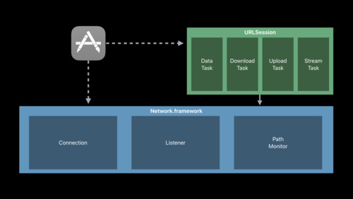
Introducing Network.framework: A modern alternative to Sockets
The new Network.framework API gives you direct access to the same high-performance user-space networking stack used by URLSession. If you're considering using Berkeley Sockets in your app or library, learn what better options are available to you.
System Services English, Japanese, Simplified Chinese
-